Chapter 2 Correlation
2.1 Introduction
In everyday communication, the word correlation is thrown around a lot, but, what does it actually mean? In this lesson, we will explore how to use correlations to better understand how our variables interact with each other.
Today we’ll be trying to answer the question:
How do anxiety scores and studying time influence exam scores?
We’ll use a dataset called Anxiety Data.xlsx, which includes students’ exam scores, anxiety levels just before the test, and total hours spent studying.
Learning Objectives By the end of this chapter, you will be able to:
- Interpret the direction and strength of correlations.
- Compute correlations in R using
cor()andcor.test(). - Explain and calculate R² as variance explained.
- Run and interpret partial and point-biserial correlations.
- Visualize relationships using scatterplots and correlation matrices.
2.2 Loading Our Data
We start by importing the necessary packages, reading in our Excel file, and quickly doing an overview of the data.
library(readxl)
library(tidyverse)

examData <- read_xlsx("Anxiety Data.xlsx")

library(skimr)
skim(examData)| Name | examData |
| Number of rows | 103 |
| Number of columns | 5 |
| _______________________ | |
| Column type frequency: | |
| character | 1 |
| numeric | 4 |
| ________________________ | |
| Group variables | None |
Variable type: character
| skim_variable | n_missing | complete_rate | min | max | empty | n_unique | whitespace |
|---|---|---|---|---|---|---|---|
| Gender | 0 | 1 | 4 | 6 | 0 | 2 | 0 |
Variable type: numeric
| skim_variable | n_missing | complete_rate | mean | sd | p0 | p25 | p50 | p75 | p100 | hist |
|---|---|---|---|---|---|---|---|---|---|---|
| Code | 0 | 1 | 52.00 | 29.88 | 1.00 | 26.50 | 52.00 | 77.50 | 103.00 | ▇▇▇▇▇ |
| Revise | 0 | 1 | 19.85 | 18.16 | 0.00 | 8.00 | 15.00 | 23.50 | 98.00 | ▇▃▁▁▁ |
| Exam | 0 | 1 | 56.57 | 25.94 | 2.00 | 40.00 | 60.00 | 80.00 | 100.00 | ▃▅▅▇▃ |
| Anxiety | 0 | 1 | 74.34 | 17.18 | 0.06 | 69.78 | 79.04 | 84.69 | 97.58 | ▁▁▁▆▇ |
2.3 Visualizing Relationships
Before we start running any statistical analyses, we always want to begin by graphing our data, providing us with a visual understanding of what story our data is telling us. With correlations, we want to focus on scatterplots. As a reminder, a scatterplot needs two numerical values.
Since we are trying to better understand exam data, let’s create three scatterplots: one showing the relationship between studying and exam scores, one between anxiety and exam scores, and one between studying and anxiety.
p1<- ggplot(examData, aes(x = Revise, y = Exam)) +
  geom_point(aes(color = Gender), size = 3, alpha = 0.8) +
  geom_smooth(method = "lm", se = FALSE) +
  theme_minimal() +
  labs(
    title = "Revision vs Exam Performance",
    subtitle = "Do students who revise more score higher?",
    x = "Revision Time (hours)", y = "Exam Score (%)"
  )
p1
## `geom_smooth()` using formula = 'y ~ x'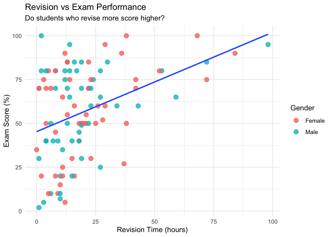
p2<- ggplot(examData, aes(x = Anxiety, y = Exam)) +
  geom_point(aes(color = Gender), size = 3, alpha = 0.8) +
  geom_smooth(method = "lm", se = FALSE) +
  theme_minimal() +
  labs(
    title = "Exam Anxiety vs Exam Performance",
    subtitle = "Does anxiety relate to exam performance?",
    x = "Exam Anxiety (0–100)", y = "Exam Score (%)"
  )
p2
## `geom_smooth()` using formula = 'y ~ x'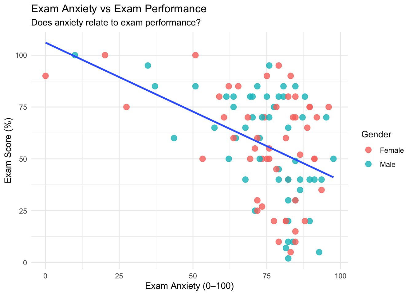
p3<- ggplot(examData, aes(x = Revise, y = Anxiety)) +
  geom_point(aes(color = Gender), size = 3, alpha = 0.8) +
  geom_smooth(method = "lm", se = FALSE) +
  theme_minimal() +
  labs(
    title = "Revision vs Exam Anxiety",
    subtitle = "Do students who revise more have more anxiety?",
    x = "Revision Time (hours)", y = "Exam Anxiety (0–100)"
  )
p3
## `geom_smooth()` using formula = 'y ~ x'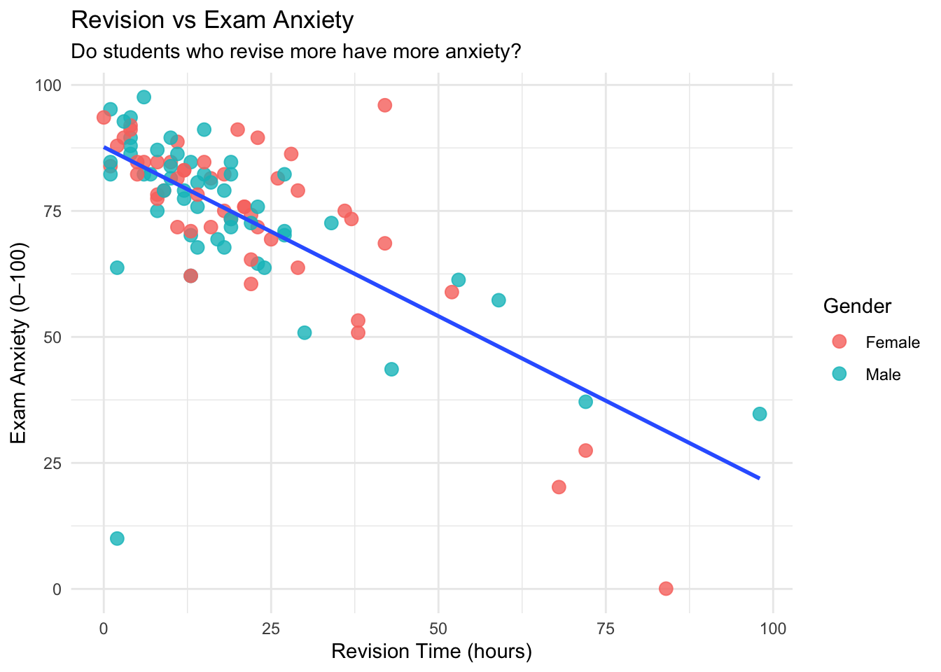
Intuitively, these graphs make sense (which is what we want to see). From a visual perspective:
- Graph 1 indicates that as someone studies more for the exam, they do better on the exam (a Christmas miracle!).
- Graph 2 indicates that the more anxiety someone has, the worse they’ll perform on the exam.
- Graph 3 indicates that the more time you spend studying for an exam, the less anxiety you will have before the exam.
One of the main reasons why we visualize our data is to see if it is linear. We are only going to be talking about linear data in this chapter. If your scatterplot shows a curve, use a non-parametric alternative like Spearman’s rank correlation instead.
For today, we are really focusing on studying time, anxiety scores, and exam scores. If we did not want to manually create 3 different scatterplots, we could utilize the pairs command.
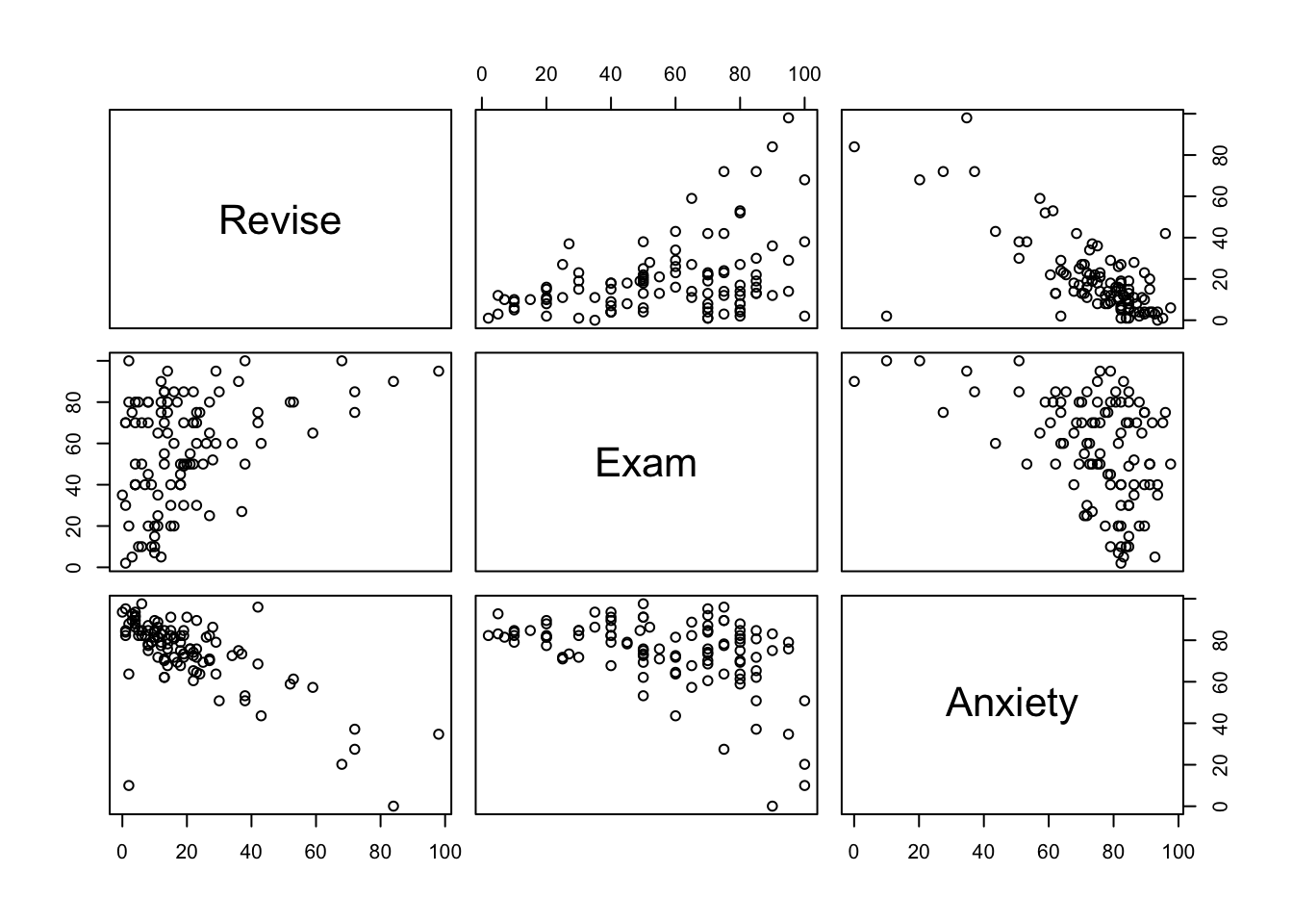
This creates a scatterplot for all of the columns we specify. It may take a while to get used to reading this, but the way to read these is where the names would intersect is the scatterplot that represents those two variables. For example, the exam vs revise scatterplot would be the top middle scatterplot.
We can get even fancier and use the command ggpairs from the GGally function.
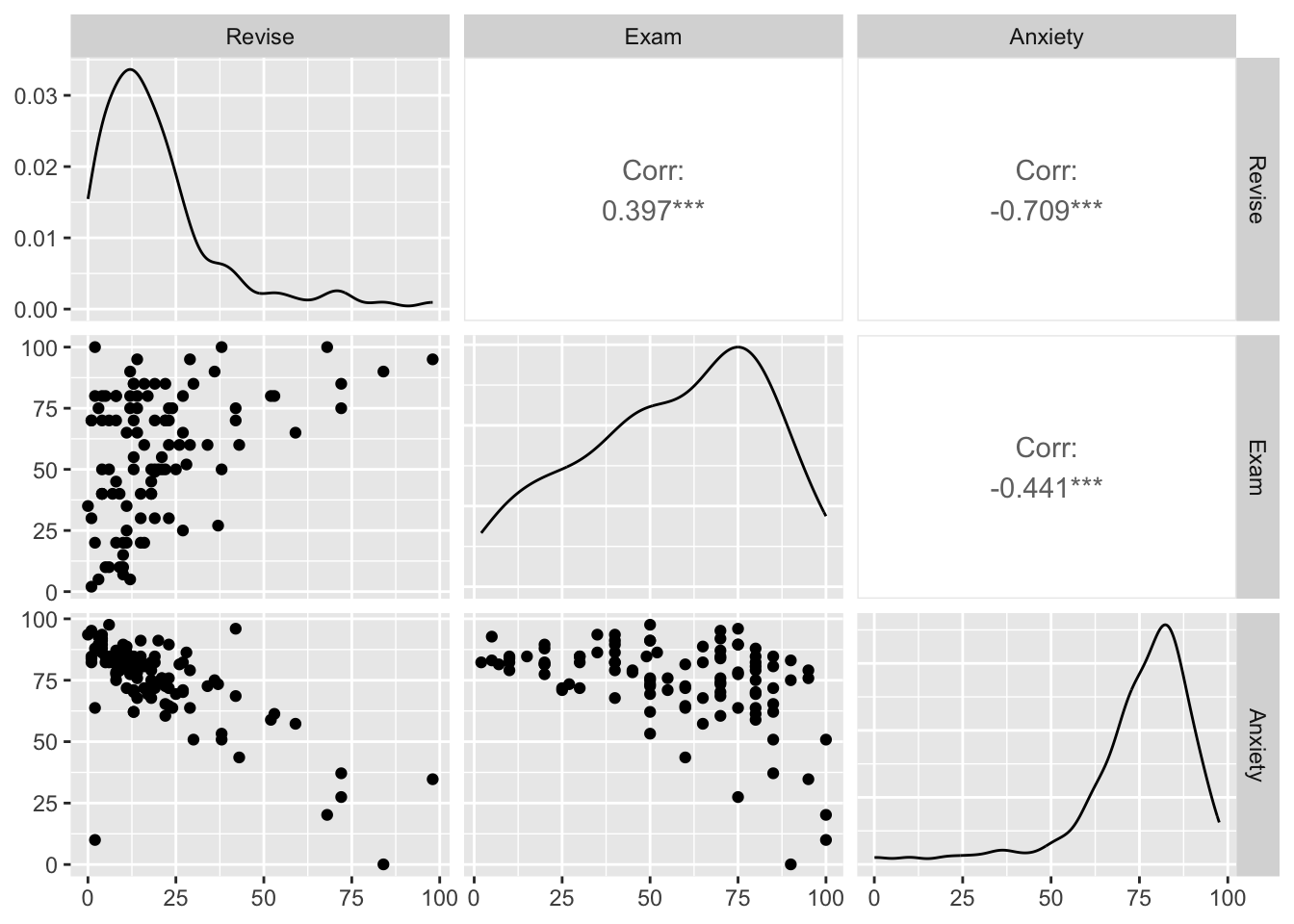
This not only creates the three scatterplots, but also creates a histogram in the form of a line, and spoiler, the correlation coefficient for all combinations!
2.4 Running Correlations (r)
Since the cat is out of the bag, it is now time for us to officially run some correlations.
The end result of running a correlation is to get the correlation coefficient (r), which is a number between -1 and 1. There are two things we look for in a correlation coefficient:
- Direction: this is denoted by whether the coefficient is negative or positive. A negative number does not mean it is bad, and a positive number does not mean it is good. It is simply saying that if it is:
- Negative- then when one variable increases, the other decreases (Anxiety vs Exam)
- Positive- when one variable increases, the other also increases (Studying vs Exam)
- Strength: this is how close to -1 or 1 it is. The closer to -1 or 1, the stronger the correlation between the two variables. The inverse is also true: the closer to 0 the number is, the weaker the correlation is.
By definition, the correlation coefficient measures the strength and direction of a linear relationship between two variables.
We can use the following general guidelines for interpreting correlation strength. However, different disciplines may have different guidelines.
| Absolute value of r | Strength of relationship |
|---|---|
| r < 0.25 | No relationship |
| 0.25 < r < 0.5 | Weak relationship |
| 0.5 < r < 0.75 | Moderate relationship |
| r > 0.75 | Strong relationship |
Now that we understand what the correlation coefficient (r) represents, let’s calculate it! We can use the cor command for this.
## [1] 0.3967207## [1] -0.4409934## [1] -0.7092493Success! We have three different correlation coefficients. Let us look at all three 1. A positive, somewhat weak correlation 2. A negative, somewhat weak correlation 3. A negative, somewhat strong correlation
Now, we can also utilize the cor.test command, which not only will give us the correlation coefficient, but also the p-value, so we can identify if the correlation is statistically significant or not.
##
##  Pearson's product-moment correlation
##
## data:  examData$Revise and examData$Exam
## t = 4.3434, df = 101, p-value = 3.343e-05
## alternative hypothesis: true correlation is not equal to 0
## 95 percent confidence interval:
##  0.2200938 0.5481602
## sample estimates:
##       cor
## 0.3967207##
## Pearson's product-moment correlation
##
## data: examData$Anxiety and examData$Exam
## t = -4.938, df = 101, p-value = 3.128e-06
## alternative hypothesis: true correlation is not equal to 0
## 95 percent confidence interval:
## -0.5846244 -0.2705591
## sample estimates:
## cor
## -0.4409934##
## Pearson's product-moment correlation
##
## data: examData$Revise and examData$Anxiety
## t = -10.111, df = 101, p-value < 2.2e-16
## alternative hypothesis: true correlation is not equal to 0
## 95 percent confidence interval:
## -0.7938168 -0.5977733
## sample estimates:
## cor
## -0.7092493Turns out all three are statistically significant! There’s something just as important as the r value and p value: the method used to calculate it. By default cor and cor.test use Pearson’s method. Going back to visualizing our data, we can only use Pearson’s method if our data is linear.
Question: What if we do not want to run all the correlations one by one…
2.5 Correlation Matrix
Right now, we only have three variables we want to run correlations with. But, what if we had 50? Are we going to run 50 lines of code? No! We can, instead, run a correlation matrix, which conducts a correlation between any and all numeric values. The key here is that your data must only contain numeric values, so make sure you clean your data first. Again, as before, we can utilize the cor command.
# Selecting numeric variables only (if dataset contains non-numeric columns)

examData_numeric<- examData %>% select(1:4)
cor(examData_numeric)
## Code Revise Exam Anxiety
## Code 1.00000000 -0.2218286 -0.09779376 0.1135652
## Revise -0.22182864 1.0000000 0.39672070 -0.7092493
## Exam -0.09779376 0.3967207 1.00000000 -0.4409934
## Anxiety 0.11356524 -0.7092493 -0.44099341 1.0000000# Hint: use = "pairwise.complete.obs" handles any missing values safely
corr_matrix <- cor(examData_numeric, use = "pairwise.complete.obs")
corr_matrix## Code Revise Exam Anxiety
## Code 1.00000000 -0.2218286 -0.09779376 0.1135652
## Revise -0.22182864 1.0000000 0.39672070 -0.7092493
## Exam -0.09779376 0.3967207 1.00000000 -0.4409934
## Anxiety 0.11356524 -0.7092493 -0.44099341 1.0000000Boom! We were able to calculate the correlation coefficients in one line of code for all three variables. We are always aiming to get the most done with as little code as possible.
2.6 Coefficient of Determination (R^2)
Once you have a correlation coefficient, what’s next? Well, with the correlation coefficient, we can then calculate R^2, otherwise known as the coefficient of determination, which measures the proportion of variance in one variable that is explained by the other. In simple correlations, R² is just r², the square of the correlation coefficient.
R^2 tells us how much of the variance in Y is explained by X. We can use a combination of the cor command and base R.
# R^2 tells us the percentage of variance shared between two variables.

# Calculating the R^2 value
cor(examData$Anxiety, examData$Exam)^2
## [1] 0.1944752## [1] 19.45## [1] 15.73873## [1] 50.30345The above values are saying: 1. 19.45% of all the variation of exam scores is due to anxiety. 2. 15.74% of all the variation of exam scores is due to studying time. 3. 50.30% of all the variation of anxiety scores is due to studying time.
Number three seems particularly strong. There may be more to investigate here.
2.7 Partial Correlations
When we were looking at our R^2 values, we saw a decent percentage of the variation in exam scores was due to both anxiety scores and studying time. We also saw that half of the variation in anxiety scores was due to studying time. So, maybe, there is some overlap between anxiety+studying time and exam scores.
To account for this, we can utilize the ppcor library and run a partial correlation using the pcor.test command.
Hint: when running a partial correlation using pcor.test, the last variable in the command is the one being controlled for.
## Loading required package: MASS##
## Attaching package: 'MASS'## The following object is masked from 'package:dplyr':
##
## select# Partial correlation between Anxiety and Exam controlling for Revise
pcor.test(examData$Anxiety, examData$Exam, examData$Revise)## estimate p.value statistic n gp Method
## 1 -0.2466658 0.01244581 -2.545307 103 1 pearson# Uno reverse: controlling for Anxiety instead of Revise
pcor.test(examData$Revise, examData$Exam, examData$Anxiety)## estimate p.value statistic n gp Method
## 1 0.1326783 0.1837308 1.338617 103 1 pearsonAfter controlling for studying time, we now see that: 1. The correlation coefficient is still negative between anxiety scores and exam scores, but it is cut by nearly half! 2. The correlation coefficient is still positive between studying time and exam scores, but now, not only is it not as strong, but it is not even statistically significant.
This confirms our suspicion that the relationship between anxiety and exam performance partly overlaps with study time. Once we control for study time, the unique relationship between anxiety and exam scores becomes weaker — showing that part of the correlation was actually due to study habits.
Logically, this makes sense: the more you study, the less anxiety you will have! So maybe, just maybe, you’ll consider studying for your next exam.
2.8 Biserial and Point-Biserial Correlations
Now, what about if you have logical variables? T/F, Yes/No, M/F, etc? How can we run a correlation on them if they are not numeric? Great question! What we can do is turn them into “numeric” values, turning them into 0’s and 1’s, and then run a correlation.
# What do you do when you have a biserial (you're either dead or alive)
# Or when you have a point-biserial (failed by 1 pts vs failed by 42 pts vs passed by 4pts)
examData$Gender_Binary<- ifelse(examData$Gender=="Female",0,1)
cor.test(examData$Exam, examData$Gender_Binary)
##
## Pearson's product-moment correlation
##
## data: examData$Exam and examData$Gender_Binary
## t = 0.046974, df = 101, p-value = 0.9626
## alternative hypothesis: true correlation is not equal to 0
## 95 percent confidence interval:
## -0.1890216 0.1980196
## sample estimates:
## cor
## 0.004674066From this, we can see that sex does not significantly correlate with exam scores.
2.9 Grouped Correlations
While sex may not be a strong correlation, maybe there are differences within the genders, and a grouped correlation should be conducted. To do this, all we need to do is first group by gender, and then run correlations on our desired variables.
# This allows us to see if relationships differ by gender.
examData %>%
  group_by(Gender) %>%
  summarise(
    r_rev_exam = cor(Revise, Exam),
    r_anx_exam = cor(Anxiety, Exam)
  )
## # A tibble: 2 × 3
## Gender r_rev_exam r_anx_exam
## <chr> <dbl> <dbl>
## 1 Female 0.440 -0.381
## 2 Male 0.359 -0.506Our results show that direction does not change within the sexes, but the strength of the correlations does. For instance, in males, anxiety scores have a deeper impact on exam scores than females.
In the next chapter (see Chapter 3), we’ll use what we learned here to build predictive models — moving from describing relationships to forecasting outcomes.
2.10 Conclusion
Congratulations! You have visualized correlations, obtained the correlation coefficient, and even computed how much variability is shared between two variables.
In the next chapter, we will use what we learned today to not only measure how related two variables are, but figure out ways to use one variable to predict another!
Key Terms - Correlation coefficient (r): Measures the strength and direction of a linear relationship. - Coefficient of determination (R²): Proportion of variance in Y explained by X. - Partial correlation: Correlation between two variables after controlling for another. - Point-biserial correlation: Correlation between a continuous and dichotomous variable.
2.11 Key Takeaways
- Always visualize relationships before interpreting numbers!!!
- Pearson correlations measure linear relationships between numeric variables.
- Correlation ≠ causation
- R² tells us how much variance in one variable is shared with another.
- Partial correlations show unique relationships after controlling for other variables.
- Point-biserial correlations apply when one variable is dichotomous.