5 Statistical Dispersion
While Central Tendency identifies the “middle” of a dataset, Measures of Dispersion/Variability describe how widely the values are spread around that center. In other words, dispersion quantifies the degree of variability or diversity within the data. Two datasets can share the same average, yet their distributions may look completely different—one tightly clustered, the other broadly scattered.
By combining Central Tendency with these measures of dispersion (see, Figure 5.1), readers gain both numerical and visual insights, enabling a more accurate and holistic interpretation of their data [1]–[4].
5.1 Range
The range is the simplest measure of dispersion, representing the difference between the largest and smallest observations in a dataset. It provides a quick sense of how spread out the data are [5].
Formula:
\[Range = X_{max} - X_{min}\] A larger range indicates greater variability among the data values, while a smaller range suggests that the data are more concentrated around the mean. The range is easy to compute and understand, making it a useful measure for providing a quick and rough estimate of how widely the data are spread. However, it has notable limitations: it is highly sensitive to outliers and does not take into account the distribution of values between the smallest and largest observations [6], [7].
Example:
A researcher measures the systolic blood pressure reduction (in mmHg) of five patients after taking Drug A:
\[ [45, 52, 49, 47, 55] \]
We can compute the range of the blood pressure reduction values, as the following:
\[
Range = X_{max} - X_{min} = 55 - 45 = 10
\]
The reductions vary by 10 mmHg, indicating relatively low variability among patients.
5.2 Variance
Variance measures the average of the squared deviations from the mean. It quantifies how much each data point differs from the mean, capturing the degree of spread in the dataset.
Formulas:
For a population: \[\sigma^2 = \frac{\sum_{i=1}^{N}(X_i - \mu)^2}{N}\]
For a sample: \[s^2 = \frac{\sum_{i=1}^{n}(X_i - \bar{X})^2}{n-1}\]
A higher variance indicates that the data points are more widely spread from the mean, while a lower variance suggests that they are clustered more closely together. Variance takes into account all data points in a dataset, not just the extremes, and serves as the foundation for more advanced statistical measures such as standard deviation and ANOVA. However, because variance is expressed in squared units, it can be less intuitive to interpret directly. Additionally, it is sensitive to extreme values, which can disproportionately affect the measure of variability [6], [7].
Example:
We can compute the sample variance of the blood pressure reduction values, as the following:
- Step One: Compute the mean,
\[ \bar{X} = \frac{46 + 50 + 54 + 48 + 52}{5} = \frac{250}{5} = 50 \]
- Step Two: Compute each squared deviation,
| \(X_i\) | \((X_i - \bar{X})\) | \((X_i - \bar{X})^2\) |
|---|---|---|
| 46 | -4 | 16 |
| 50 | 0 | 0 |
| 54 | 4 | 16 |
| 48 | -2 | 4 |
| 52 | 2 | 4 |
- Step Three: Compute the sample variance:
\[ s^2 = \frac{\sum (X_i - \bar{X})^2}{n - 1} \]
\[ s^2 = \frac{16 + 0 + 16 + 4 + 4}{5 - 1} = \frac{40}{4} = 10 \]
The sample variance is 10 (mmHg²), meaning that, on average, the squared deviations of blood pressure reductions from the mean are 10 units.
5.3 Standard Deviation
The standard deviation (SD) is the square root of the variance. It measures the average distance of each data point from the mean and is expressed in the same units as the original data.
Formulas:
For a population: \[\sigma = \sqrt{\frac{\sum_{i=1}^{N}(X_i - \mu)^2}{N}}\]
For a sample: \[s = \sqrt{\frac{\sum_{i=1}^{n}(X_i - \bar{X})^2}{n-1}}\]
A low standard deviation indicates that the data points are close to the mean, reflecting low variability within the dataset, while a high standard deviation shows that the data points are more widely dispersed, indicating higher variability. One of the main advantages of standard deviation is that it is expressed in the same units as the original data, making it easier to interpret compared to variance. It is also widely used in both descriptive and inferential statistics for assessing data consistency and reliability. However, standard deviation is influenced by outliers, which can distort the measure of spread, and it assumes that the data distribution is approximately normal for its interpretation to be most meaningful [8].
Example:
Recall that the sample variance (\(s^2\)) was:
\[ s^2 = 10 \]
The standard deviation (\(s\)) is the square root of the variance:
\[ s = \sqrt{s^2} = \sqrt{10} \approx 3.16 \]
The sample standard deviation is 3.16 mmHg, which means that, on average, each patient’s blood pressure reduction differs from the mean by about 3.16 mmHg.
5.4 Study Cases
A clinical study was conducted to evaluate the effectiveness and consistency of three different antihypertensive drugs—Drug A, Drug B, and Drug C—in lowering patients’ blood pressure. Each group of patients received one type of drug for four weeks. The goal was to reduce systolic blood pressure (SBP) to around 120 mmHg, which is considered normal according to the World Health Organization (WHO) and the American Heart Association (AHA) guidelines. Although the mean reduction in blood pressure for all three drugs is approximately 50 mmHg, the variability in response differs significantly. This variation reflects how consistent or scattered the treatment effects are among patients. Let consider thi dataset (tab-dataset-bab51?)
Graphs help visualize the variability in treatment effects among the three drugs:
- Boxplots show the spread and outliers of blood pressure reduction.
- Histograms reveal how reductions are distributed among patients.
- Scatterplots illustrate how responses vary with other factors.
These visuals highlight that Drug A has consistent effects, Drug B shows some outliers, and Drug C displays a wider, skewed variation.
5.4.1 Boxplots
Before analyzing the differences among Drug A, Drug B, and Drug C, it is important to understand how boxplots represent data dispersion. A boxplot provides a compact visual summary of a dataset through five key statistics: minimum, first quartile (Q1), median (Q2), third quartile (Q3), and maximum, etc.
# Read dataset above then calculate
# Summary statistics to verify means are exactly 50
drug_summary <- drug_data %>%
  group_by(Drug) %>%
  summarise(
    Mean = mean(BP_Reduction),
    Min = min(BP_Reduction),
    Max = max(BP_Reduction),
    Range = Max - Min,
    Variance = var(BP_Reduction),
    SD = sd(BP_Reduction)
  )

# ==========================================================
# Display interactive table
# ==========================================================
datatable(
  drug_summary %>%
    mutate(across(where(is.numeric), ~round(., 2))),  # numeric to 2 decimals
  options = list(
    dom = 't',        # show only the table
    paging = FALSE,   # disable pagination
    ordering = FALSE  # disable sorting
  ),
  rownames = FALSE
)
The box represents the interquartile range (IQR = Q3 − Q1), showing where the middle 50% of data points lie. The line inside the box marks the median, while the “whiskers” extend to the smallest and largest values within 1.5 × IQR. Any points beyond the whiskers are plotted individually as outliers, indicating unusually high or low observations.
# Plot: violin + boxplot with mean annotation --------
library(ggplot2)

ggplot(drug_data, aes(x = Drug, y = BP_Reduction, fill = Drug)) +
  # Violin plot for full distribution
  geom_violin(alpha = 0.4, trim = FALSE, color = NA) +
  # Boxplot overlay (narrower width)
  geom_boxplot(width = 0.15, outlier.color = "red", alpha = 0.6) +
  # Mean point
  stat_summary(fun = mean, geom = "point", shape = 23, size = 3, fill = "blue", color = "black") +
  # Mean label
  geom_text(
    data = drug_summary,
    aes(x = Drug, y = Mean + 3,
        label = paste0("Mean = ", formatC(Mean, digits = 2, format = "f"))),
    color = "blue", size = 3.5, fontface = "bold", inherit.aes = FALSE
  ) +
  labs(
    title = "Drug Effects: Equal Means (50) with Different Dispersions",
    subtitle = "Drug A = normal | Drug B = normal + outliers | Drug C = right-skewed + extreme outliers",
    x = "",
    y = "Effect (e.g., reduction in systolic BP, mmHg)"
  ) +
  theme_minimal(base_size = 13) +
  theme(
    legend.position = "none",
    plot.title = element_text(face = "bold")
  )
Interpretation:
- Drug A: Symmetrical violin and narrow boxplot indicate low variability and a consistent effect among patients.
- Drug B: Violin shows slight widening at higher values; boxplot highlights mild outliers. Indicates moderate variability; most patients respond similarly, but a few have stronger effects.
- Drug C: Right-skewed violin with long tail and extreme points. Boxplot captures these extremes, showing high variability and skewness. Some patients experience much higher reductions than the majority.
5.4.2 Histograms
A histogram provides a visual summary of a dataset by dividing the range of data into consecutive intervals, called bins, and displaying the frequency or density of observations in each bin. The height of each bar reflects how many data points fall within that interval. Histograms allow us to quickly assess the shape of the distribution, the spread of the data, the presence of skewness, and potential outliers.
# -------- Plot: Histogram + Density + Smart Mean Label Placement --------
library(dplyr)
library(ggplot2)

# Calculate density peaks (for label positioning)
density_peaks <- drug_data %>%
  group_by(Drug) %>%
  summarise(PeakY = max(density(BP_Reduction)$y))

# Combine with mean values
label_data <- left_join(drug_summary, density_peaks, by = "Drug")

# Plot
ggplot(drug_data, aes(x = BP_Reduction, fill = Drug)) +
  geom_histogram(aes(y = after_stat(density)), alpha = 0.5,
                 color = "black", bins = 100, position = "identity") +
  geom_density(alpha = 0.2, color = "darkblue", size = 1) +
  geom_vline(data = drug_summary, aes(xintercept = Mean, color = Drug),
             linetype = "dashed", size = 1) +
  geom_text(
    data = label_data,
    aes(x = Mean, y = PeakY + 0.005,  # just above peak
        label = paste0("Mean = ", formatC(Mean, digits = 2, format = "f"))),
    color = "blue", size = 3.5, fontface = "bold"
  ) +
  facet_wrap(~Drug, ncol = 1, scales = "free_y") +
  labs(
    title = "Distribution of Blood Pressure Reduction by Drug",
    subtitle = "Equal means ($\\approx$ 50 mmHg) but different dispersions",
    x = "Blood Pressure Reduction (mmHg)",
    y = "Density"
  ) +
  theme_minimal(base_size = 13) +
  theme(legend.position = "none")
# -------- Plot: All Drugs in One Frame --------
library(dplyr)
library(ggplot2)

# Gabungkan mean + density peak (optional: tidak wajib kalau mau manual y posisi)
density_peaks <- drug_data %>%
  group_by(Drug) %>%
  summarise(PeakY = max(density(BP_Reduction)$y))

label_data <- left_join(drug_summary, density_peaks, by = "Drug")

ggplot(drug_data, aes(x = BP_Reduction, fill = Drug, color = Drug)) +
  # Histogram density-normalized
  geom_histogram(aes(y = after_stat(density)),
                 position = "identity", bins = 80, alpha = 0.35) +
  # Density curve
  geom_density(alpha = 0.3, linewidth = 1) +
  # Mean line
  geom_vline(data = drug_summary,
             aes(xintercept = Mean, color = Drug),
             linetype = "dashed", linewidth = 1) +
  # Mean label above each density peak
  geom_text(
    data = label_data,
    aes(x = Mean, y = PeakY + 0.002,
        label = paste0("Mean = ", formatC(Mean, digits = 2, format = "f")),
        color = Drug),
    size = 4, fontface = "bold", show.legend = FALSE
  ) +
  labs(
    title = "Distribution of Blood Pressure Reduction (All Drugs)",
    subtitle = "All means $\\approx$ 50 mmHg but with different spread and skewness",
    x = "Blood Pressure Reduction (mmHg)",
    y = "Density",
    fill = "Drug",
    color = "Drug"
  ) +
  theme_minimal(base_size = 13) +
  theme(
    legend.position = "top",
    plot.title = element_text(face = "bold")
  )
Interpretation:
- Drug A: Narrow histogram and density curve indicate tight clustering around the mean. Low variability → consistent effect among patients.
- Drug B: Slightly wider spread and presence of minor outliers. Moderate variability → most patients respond similarly, but a few show extreme reduction.
- Drug C: Right-skewed distribution with long tail and extreme outliers. High variability → responses vary greatly, and some patients experience very high reductions.
5.4.3 Scatterplots
Here’s a practical scatterplot example using Drug A, B, and C, showing blood pressure reductions for individual patients, including trend lines and mean reference.
# -------- Scatterplot --------
ggplot(drug_data, aes(x = PatientID, y = BP_Reduction, color = Drug)) +
  geom_point(size = 2, alpha = 0.7) +
  geom_hline(yintercept = 50, linetype = "dashed", color = "black") +
  labs(
    title = "Scatterplot of Blood Pressure Reduction by Drug",
    subtitle = "Each point represents a patient; dashed line shows the mean (50 mmHg)",
    x = "Patient ID",
    y = "Blood Pressure Reduction (mmHg)"
  ) +
  theme_minimal(base_size = 13)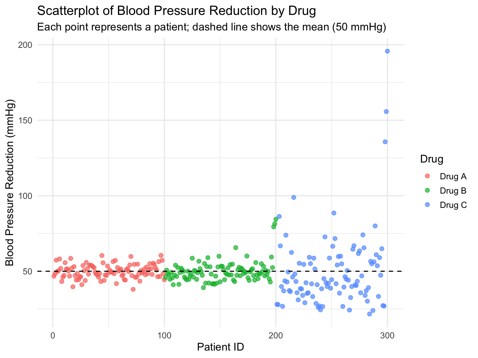
**Explanation:
- Each point represents a patient’s reduction in blood pressure.
- The x-axis shows individual patients, while the y-axis shows the BP reduction.
- The dashed line at 50 mmHg represents the mean reduction for all drugs.
- Drug A shows tightly clustered points (low variability).
- Drug B has some extreme points (outliers), increasing variability.
- Drug C shows a right-skewed distribution with extreme outliers, indicating high variability.
This scatterplot visually complements the histogram and boxplot analyses, helping to identify patient-level differences and treatment consistency.