Chapter 2 FirstRMDDemo
2.1 Introduction
This assignment was my introduction to using RMD. In it, I imported and cleaned data from NYC Open Data about shootings and performed various analyses. At the end, I wrote a brief reflection on how using RMD might benefit me in the future.
2.2 API Call
endpoint <- "https://data.cityofnewyork.us/resource/833y-fsy8.json"
resp <- httr::GET(endpoint, query = list("$limit" = 30000, "$order" = "occur_date DESC"))
shooting_data <- jsonlite::fromJSON(httr::content(resp, as = "text"), flatten = TRUE)
The code above is what I used to query the shooting data from the online database. It downloaded the 30,000 most recent shooting records and sorted the shootings by the dates on which they occurred (with the most recent first).
2.3 Data Cleaning
## [1] 9344shooting_data <- shooting_data %>%
filter(!is.na(perp_age_group))
shooting_data <- shooting_data %>%
mutate(
occur_time = hms::as_hms(occur_time),
hour = lubridate::hour(occur_time),
time_of_day = case_when(
hour >= 3 & hour < 12 ~ "Morning",
hour >= 12 & hour < 17 ~ "Afternoon",
TRUE ~ "Night"
)
)The two pieces of code above are what I used to clean the data and create timeframes corresponding to morning, day, and evening. The first piece of code identified how many rows did not contain information about the perpetrator’s age (9,344) and deleted any rows that did not contain this information. After removing missing values, the dataset contained 20400 incidents where the perpetrator age group was included. I chose to delete these because I felt that perpetrator’s age might be essential in certain analyses. The second piece of code made 3am to 12pm morning, 12pm to 5pm afternoon, and all other times night.
2.4 Personal Insight
##   perc_female
## 1    2.259804
This third chunk of code is my “personal insight.” I identified what percentage of shooters were female. The percentage of female perpetrators is about 2.3%.
2.5 Visuals
ggplot(shooting_data, aes(x = time_of_day)) +
  geom_bar(fill = "purple") +
  labs(
    title = "Shootings by Time of Day",
    x = "Time of Day",
    y = "# of Shootings"
  ) +
  theme_minimal(base_size = 16) +
  theme(
    plot.title = element_text(size = 15, face = "italic")
  )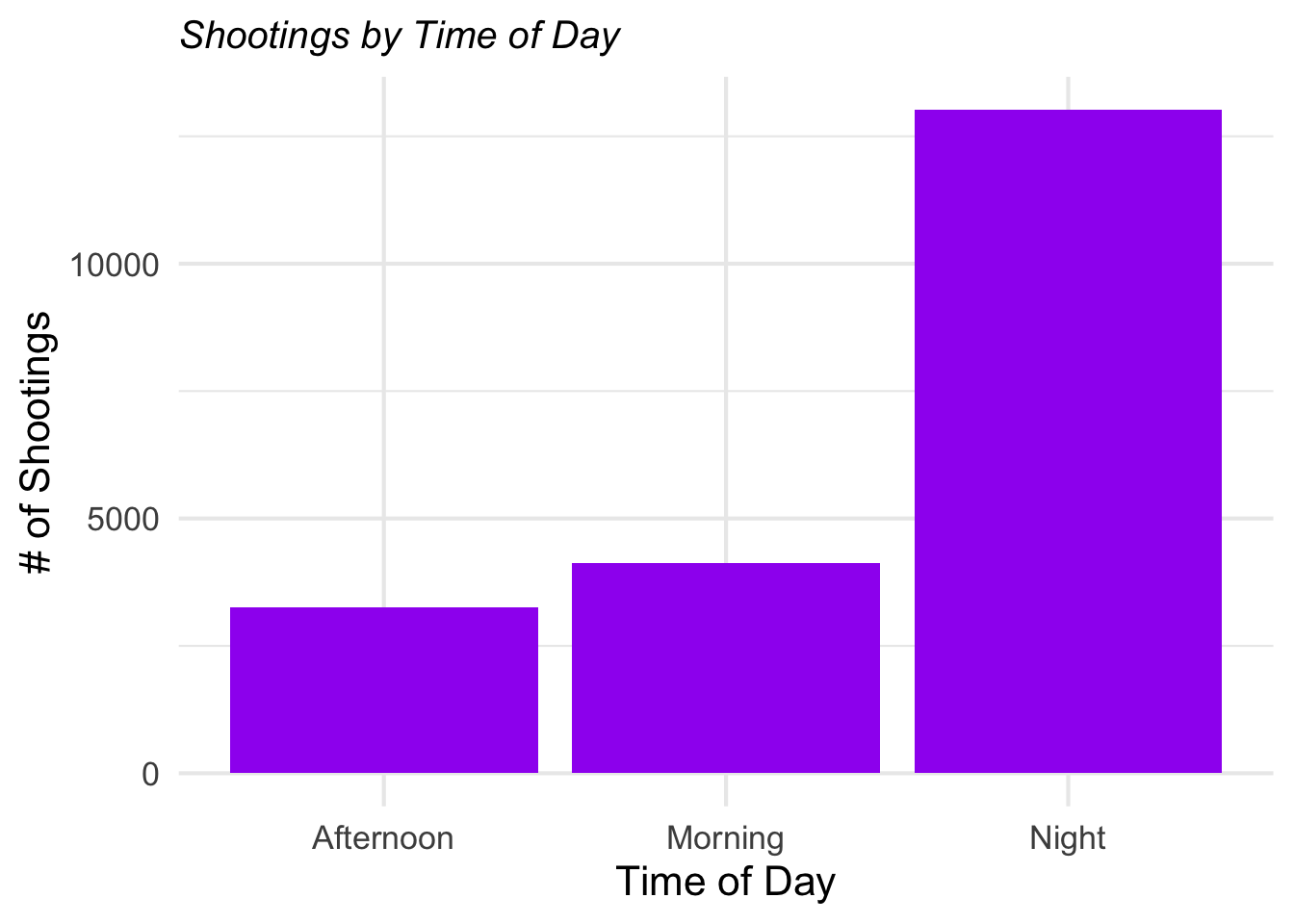
Figure 2.1: Number of Shootings by Time of Day
ggplot(shooting_data, aes(x = perp_sex)) +
  geom_bar(fill = "red") +
  facet_wrap(~ boro) +
  labs(
    title = "Shootings by Gender, Split by Borough",
    x = "Gender of Shooter",
    y = "# of Shootings"
  ) +
  theme_minimal(base_size = 15) +
  theme(
    plot.title = element_text(size = 15, face = "bold")
  )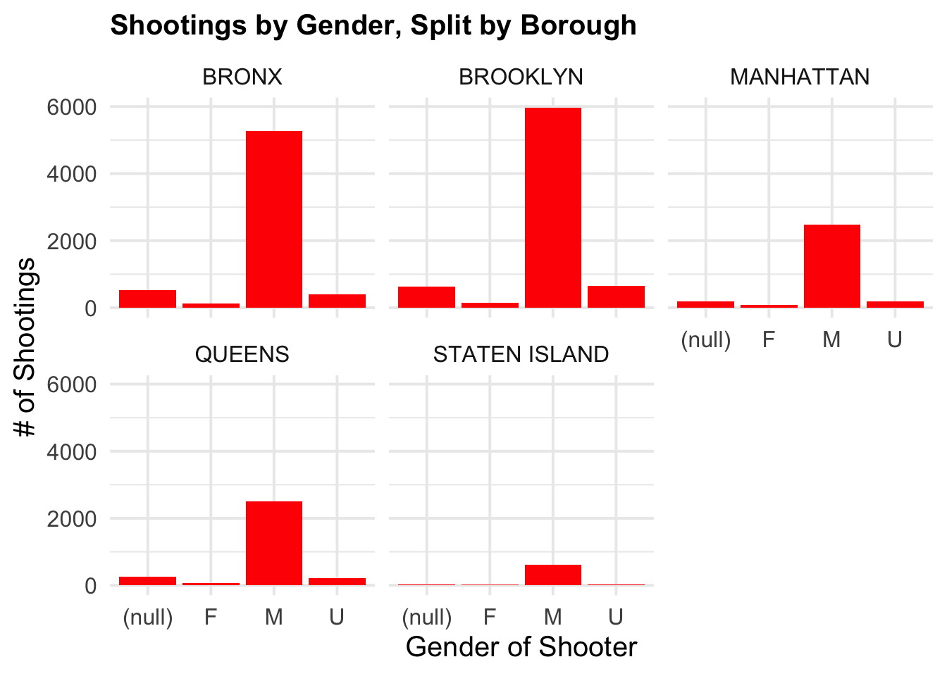
Figure 2.2: Shootings by Gender per Borough
shooting_data %>%
  count(boro, perp_sex) %>%
knitr::kable(caption = "Shootings by Gender and Borough")| boro | perp_sex | n |
|---|---|---|
| BRONX | (null) | 518 |
| BRONX | F | 134 |
| BRONX | M | 5279 |
| BRONX | U | 391 |
| BROOKLYN | (null) | 635 |
| BROOKLYN | F | 146 |
| BROOKLYN | M | 5971 |
| BROOKLYN | U | 642 |
| MANHATTAN | (null) | 191 |
| MANHATTAN | F | 87 |
| MANHATTAN | M | 2484 |
| MANHATTAN | U | 185 |
| QUEENS | (null) | 257 |
| QUEENS | F | 79 |
| QUEENS | M | 2502 |
| QUEENS | U | 222 |
| STATEN ISLAND | (null) | 27 |
| STATEN ISLAND | F | 15 |
| STATEN ISLAND | M | 609 |
| STATEN ISLAND | U | 26 |
These pieces of code are the two plots I made using ggplot. The first one shows number of shootings by time of day. The second one shows number of shootings per gender per borough. The third piece of code creates a table based on the information pertaining to shootings per gender per borough.
2.6 Reflection on Workflow
I can see this workflow being very useful in my thesis work, since my particular project has a lot of moving parts. I think that showing which analyses came when and which conclusions led to others could help clarify it for readers (particularly those unfamiliar with R). For instance, the first iteration of my project involves an independent variable that did not end up being significant (using a one-way anova), a novel survey that was an independent sample t-test showed to be significant, a linear regression that “approached” significance, and a stepwise regression that identified multiple significant predictors. It’s exploratory research, so there’s a lot to keep track of. The second iteration of the project will involve replications of many of these things, as well as further analyses building off of them. Being able to show the analyses, then explanations, then visualizations will likely help everybody keep track of what’s going on (including me and my advisor). I also think rerunning some of the analyses in R (if I have the time) might be a useful project.