5.8 Visualizing the adjusted relationships
Earlier, we plotted the outcome vs. each predictor to visualize the unadjusted relationships. How do we visualize the adjusted relationships? Remember that now the regression coefficients are adjusted for all other terms in the model. So the relationship we would like to see is the relationship between the outcome and each predictor after removing the effect of all the other predictors. We can do this using an added variable plot, using the following steps.
- Denote the outcome as \(Y\), the predictor of interest as \(X\), and the other predictors as \(Z_1, Z_2, ...\) (collectively denoted as \(\mathbf{Z}\)).
- Regress \(Y\) on \(\mathbf{Z}\) and store the residuals \((R_{yz})\) (the part of the outcome not explained by the other predictors).
- Regress \(X\) on \(\mathbf{Z}\) and store the residuals \((R_{xz})\) (the part of the predictor of interest not explained by the other predictors).
- Plot \(R_{yz}\) vs. \(R_{xz}\).
Even though each of these steps is a linear regression, the method works even if \(X\) is binary or one of the indicator variables from a factor variable with more than two levels (as illustrated below). Fortunately, you do not have to actually do these steps yourself. They are automatically carried out by the car::avPlots() function (Fox, Weisberg, and Price 2024; Fox and Weisberg 2019). Figure 5.6 illustrates this function for a few predictors.
# To plot for all the predictors.
# car::avPlots(fit.ex5.1, ask = F, layout = c(2,3))

car::avPlots(fit.ex5.1, terms = . ~ BMXWAIST + RIDAGEYR + smoker)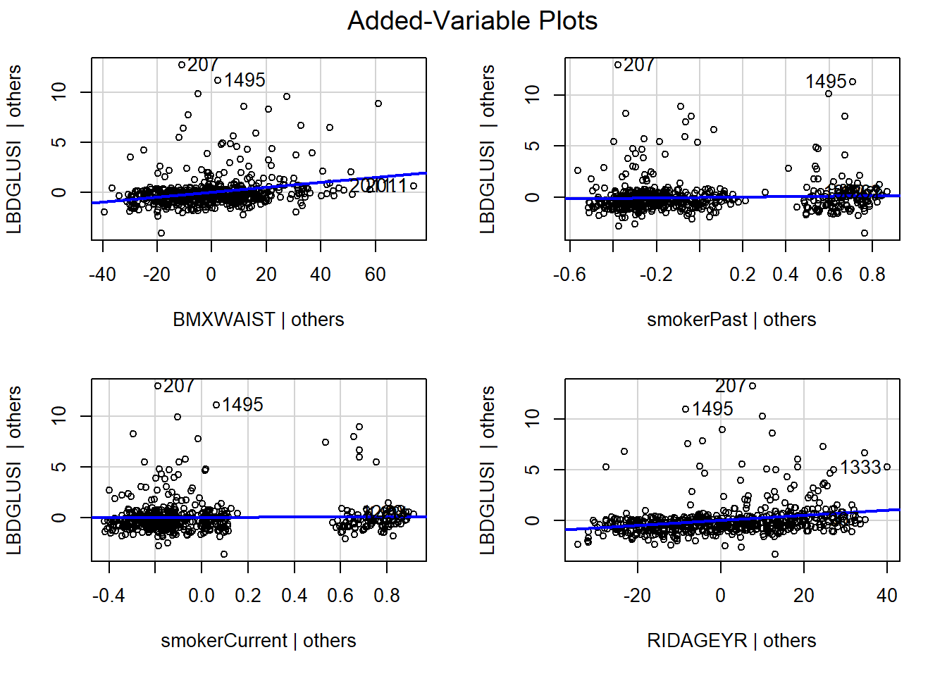
Figure 5.6: Added variable plots
Notice the axis labels: the vertical axis is labeled “LBDGLUSI | others” which corresponds to the outcome given all the predictors other than the one on the horizontal axis. The horizontal axis on each plot tells you to which predictor each added variable plot corresponds. For example, “RIDAGEYR | others” corresponds to age adjusted for all the other predictors. For a categorical predictor, there is a plot for each non-reference level. Each level of a categorical predictor has two possible values (0 or 1) so the added variable plot will have, generally, two clouds of points, one for cases where that level is 0 and one for cases where that level is 1 (but sometimes a cloud could be split into multiple clouds due to the adjustment for other predictors).
The slope of each line in each panel is the regression coefficient for that term in the model. Thus, if the line is exactly horizontal then there is no association between \(Y\) and \(X\) after adjusting for the other predictors. In our example, we see that the added-variable plot for waist circumference has a positive slope, corresponding to the positive adjusted regression coefficient in Table 5.3.